03.16.21
Behind the Scenes: The Magic of Key Art
As creative director at Ligature, one of my favorite aspects of the job is working with theatre companies designing show posters, or key art. Throughout the year, I curl up with dozens of scripts, my notebook and a cozy drink. From Shakespearian classics to brand new world premieres, I turn pages of plays that will appear on stages across the country into visual icons for each production.
Passion for Storytelling
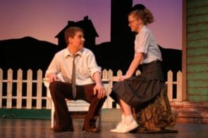
I grew up in the theatre. My first on-stage role was as an orphan in the local high school production of Oliver! at the age of 10. As a teenager, I was involved in every aspect of the drama department in my high school — if I wasn’t on stage, I was behind the scenes spray painting props or building sets. My junior year, I discovered the magic of poster design and concurrently suffered a back injury. A career on the stage was out of the cards for me; if I wasn’t going to act, though, I was determined to keep theatre in my life one way or another.
The first thing I ever designed was a poster for my high school production of A Chorus Line. When the posters came back from the printer, I held a stack in my hand and became intoxicated by the smell of the freshly dried ink. Metallic gold silhouettes of every actor in the cast danced off the rich black background. The art deco typography receded into the background like the kick line at the end of the musical. I thought it was beautiful, and even though I knew nothing about the technical aspect of design, the initial concept was there.
A few years later, after college graduation, I packed my visual communication design degree and drove across the country to my first big-kid job as the seasonal print and graphics assistant at the Williamstown Theatre Festival. Four years later, I returned for another summer and got to sink my teeth into developing my own creative process for theatrical key art that Ligature still follows today.
All My Sons (of Denmark)
Before you see the set, costumes, lights or sound, a poster lets you glimpse behind the curtain to start telling you the story. At Ligature, we begin where all directors and designers begin — with the text.
We try not only to understand the plot but also the tone and concept of the plays. No two productions of the same play will ever be the same; in roundtable conversations and in production meetings, we are keyed into specifics of the direction, which is reflected in the final art.
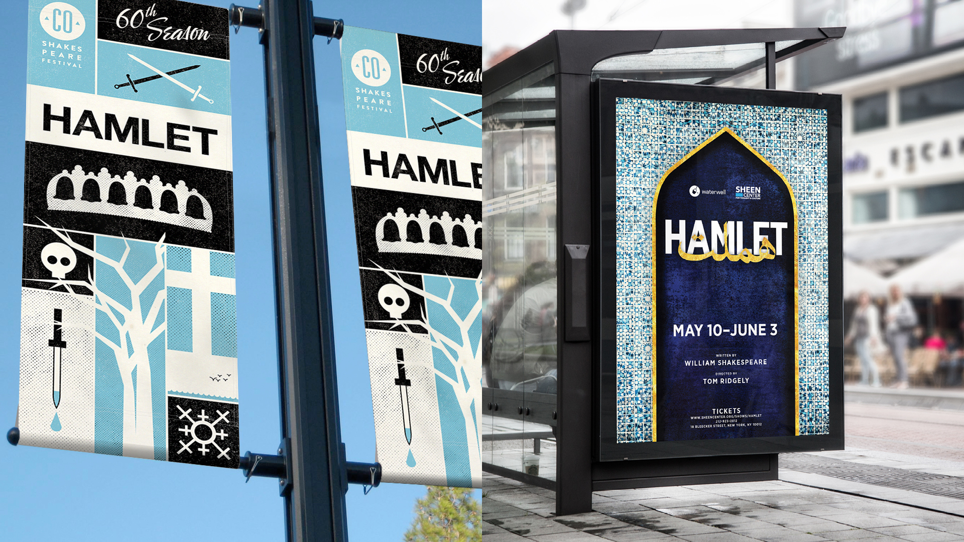
Hamlet is no doubt one of the most produced plays of all time. In one year, Ligature designed art for four very different productions of this play at regional companies across the country.
The Colorado Shakespeare Festival’s 2017 production was set in a wintry, Danish landscape starring a woman in the title role. Another Off-Broadway production, produced by Waterwell, was an English/Farsi dual-language piece set in Persia at the eve of World War I. The art for the first production featured snowflakes composed of female symbols and queenly crowns; the latter, a Persian portico surrounded with colorful tiles, all behind a gilded English/Farsi title treatment.
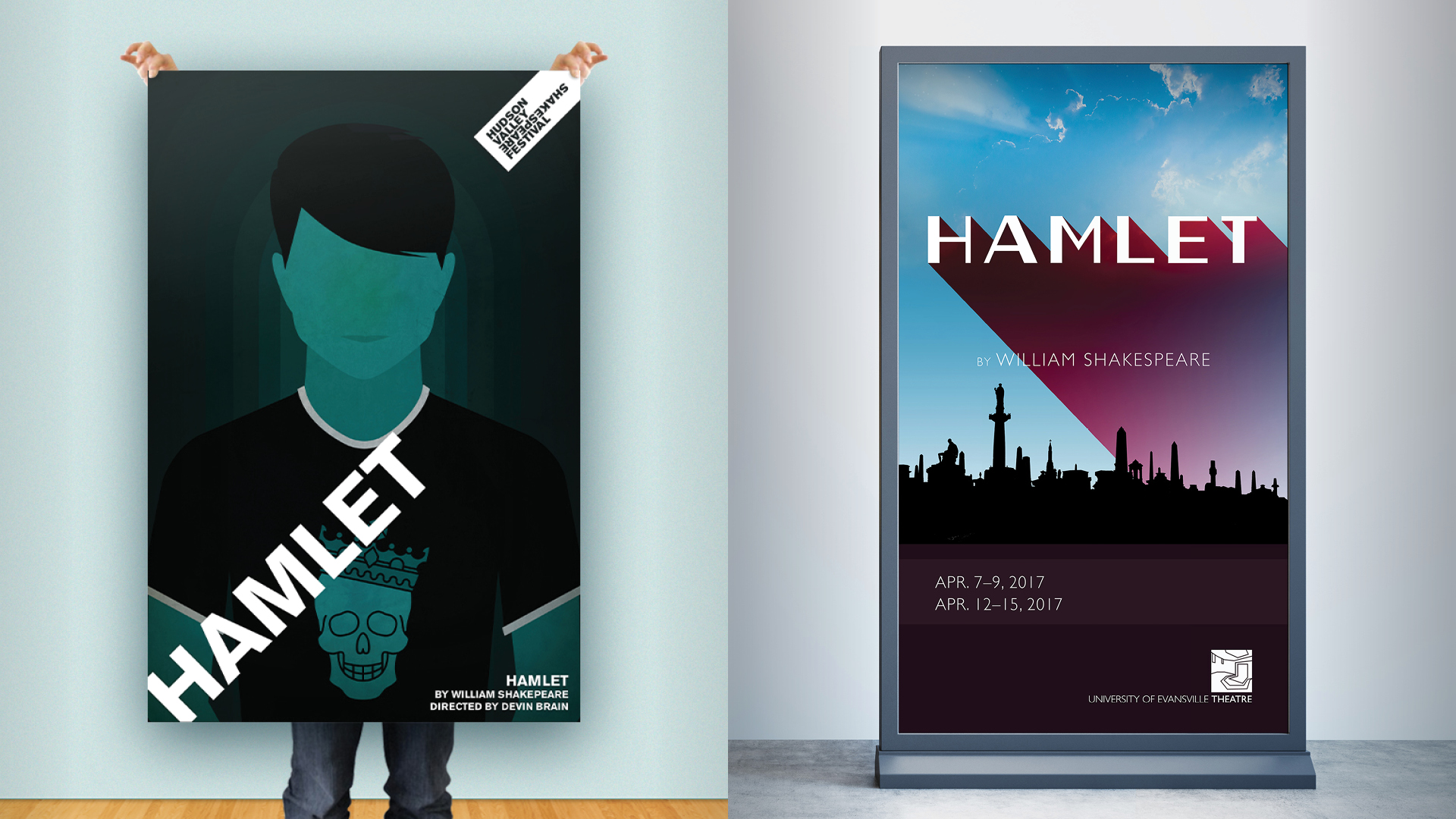
Hudson Valley Shakespeare Festival produced a Hamlet set in a high school so our young prince is sporting a graphic skull tee. And for the University of Evansville Department of Theatre, we embraced the title character’s conflict of being trapped between heaven and hell in a photo-driven approach.
Ligature’s Approach
Our philosophy is to suggest rather than to explain. Key artwork is often the first and last images that audiences see of a play; the best show art is thoughtful, iconic, memorable, and suggests something different after you experience the play.
As the stack of scripts whittles down, notebooks fill up with scribbles, quotes, and notes about dozens of plays. We continue to revisit the scripts and our notes to inform the artwork as we develop a visual language for each client’s season and design every piece of key art through an iterative process with their internal team.
Once published, the key art becomes woven into the fabric of our communities. Maybe one will catch your eye while you’re waiting in line for your daily fix at your neighborhood cafe or while chatting with friends over a beer at a RiNo brewery.
Take a look at the art, see the plays, and look again — this time a little closer.
This article was originally published by The Berkshire Eagle, Nov. 24, 2017; revised and republished here March 16, 2021.