St. Louis Shakespeare Festival
Inclusive • Ambient • Local
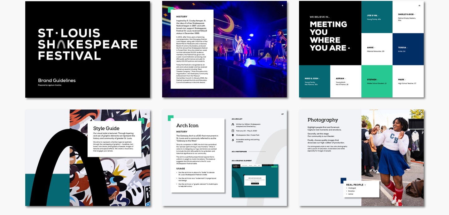
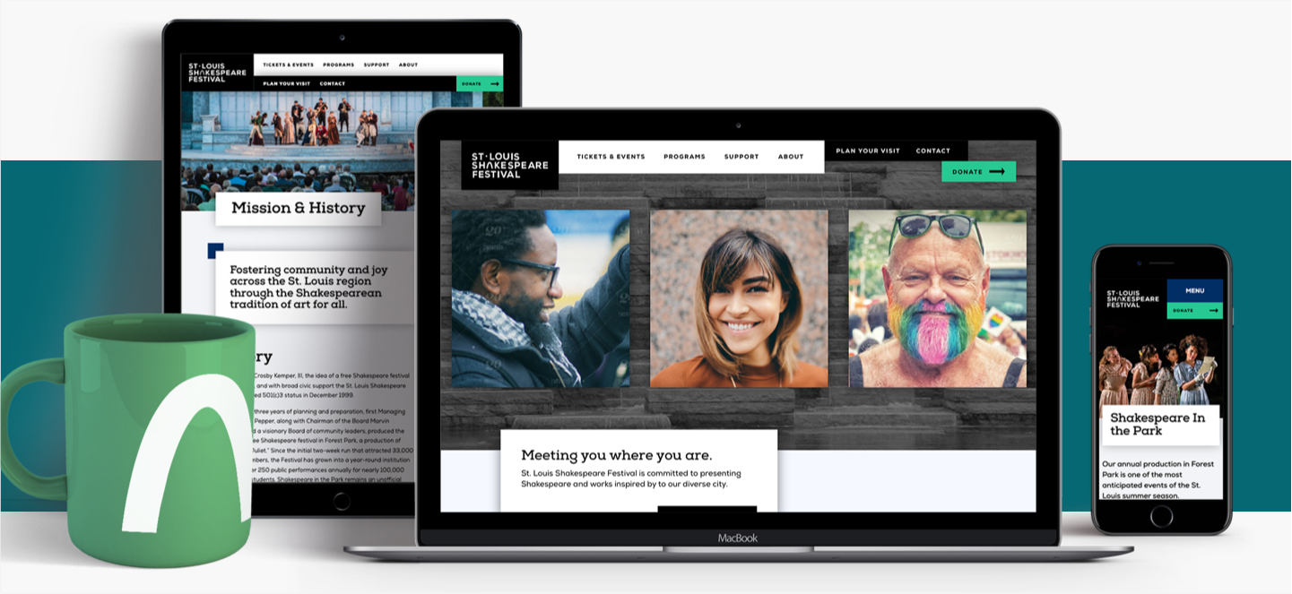
Shakespeare Festival St. Louis rebranded in their 20th anniversary season to literally put “St. Louis” at the forefront of the organization. In discovery, we assigned STL Shakes its brand pillars: Exciting, Quality, Welcoming, Ambient; and we decidedly chose the city itself as the brand’s ultimate foundation.
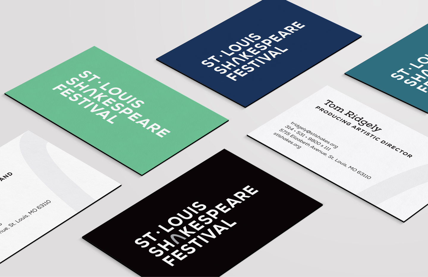
The arch in “Shakespeare” places St. Louis in the center of the mark. A cool, night-colored palette accents a modern black & white aesthetic, and exact circles & squares are used throughout the Festival’s visual identity to pay homage to the architectural proportions of St. Louis’ most-famous icon.


